Expa
Expa
Expa
Design System
Design System
Design System
Expa
Design System
Building a design system for a global platform
Building a design system for a global platform
Building a design system for a global platform
AIESEC is a global organization that operates in 114 countries and territories, with more than 7000 partner organizations. Expa is AIESEC's online platform, where participants and companies/organizations are managed. However, the lack of a proper design system has resulted in a number of problems, including inconsistencies and longer development cycles.
AIESEC is a global organization that operates in 114 countries and territories, with more than 7000 partner organizations. Expa is AIESEC's online platform, where participants and companies/organizations are managed. However, the lack of a proper design system has resulted in a number of problems, including inconsistencies and longer development cycles.
AIESEC is a global organization that operates in 114 countries and territories, with more than 7000 partner organizations. Expa is AIESEC's online platform, where participants and companies/organizations are managed. However, the lack of a proper design system has resulted in a number of problems, including inconsistencies and longer development cycles.
The introduction of the Expa Design System (EDS) allowed us to accelerate and scale production, improve the quality of our work, and strengthen collaboration between designers and developers. This enabled us to maintain consistency, ship products in a timely manner, and avoid getting bogged down in customizations that did not provide any additional value.
The introduction of the Expa Design System (EDS) allowed us to accelerate and scale production, improve the quality of our work, and strengthen collaboration between designers and developers. This enabled us to maintain consistency, ship products in a timely manner, and avoid getting bogged down in customizations that did not provide any additional value.
The introduction of the Expa Design System (EDS) allowed us to accelerate and scale production, improve the quality of our work, and strengthen collaboration between designers and developers. This enabled us to maintain consistency, ship products in a timely manner, and avoid getting bogged down in customizations that did not provide any additional value.
My role
I owned the research, design, documentation, and maintenance of the design system's component library, pattern library, and style guide in 2021.
I owned the research, design, documentation, and maintenance of the design system's component library, pattern library, and style guide in 2021.
I owned the research, design, documentation, and maintenance of the design system's component library, pattern library, and style guide in 2021.
See full team at the end
See full team at the end
See full team at the end
Establishing purpose and principles
Establishing purpose and principles
Establishing purpose and principles
We had already established a basic style guide a few years ago, which was created by our lead, Arian. The development team had been using this guide as a reference, as well as utilizing open component libraries and customizing them to fit the platform. However, we soon realized that this approach was not sustainable in the long term. To address this issue, we established a set of principles that we wanted our system to fulfill.
We had already established a basic style guide a few years ago, which was created by our lead, Arian. The development team had been using this guide as a reference, as well as utilizing open component libraries and customizing them to fit the platform. However, we soon realized that this approach was not sustainable in the long term. To address this issue, we established a set of principles that we wanted our system to fulfill.
We had already established a basic style guide a few years ago, which was created by our lead, Arian. The development team had been using this guide as a reference, as well as utilizing open component libraries and customizing them to fit the platform. However, we soon realized that this approach was not sustainable in the long term. To address this issue, we established a set of principles that we wanted our system to fulfill.
Tools over rules
Tools over rules
Tools over rules
Design system should be a toolbox, not an instruction manual. Support the team, don’t govern.
Design system should be a toolbox, not an instruction manual. Support the team, don’t govern.
Design system should be a toolbox, not an instruction manual. Support the team, don’t govern.
Lead by example
Lead by example
Show, don’t tell. Explain the best practices with real examples, not instructions on how to create them.
Show, don’t tell. Explain the best practices with real examples, not instructions on how to create them.
Lead by example
Show, don’t tell. Explain the best practices with real examples, not instructions on how to create them.
Be selective
Be selective
Be selective
Keep only what’s necessary and perfect what remains. Every addition becomes a new pattern to follow.
Keep only what’s necessary and perfect what remains. Every addition becomes a new pattern to follow.
Keep only what’s necessary and perfect what remains. Every addition becomes a new pattern to follow.
Cohesion, not consistency
Cohesion, not consistency
Cohesion, not consistency
When the system is intuitive, consistency becomes an automatic by-product of adoption.
When the system is intuitive, consistency becomes an automatic by-product of adoption.
When the system is intuitive, consistency becomes an automatic by-product of adoption.
Scalability
Scalability
Building for flexibility, design tokens and new infrastructure that helps to iterate easily across different experiences.
Building for flexibility, design tokens and new infrastructure that helps to iterate easily across different experiences.
Scalability
Building for flexibility, design tokens and new infrastructure that helps to iterate easily across different experiences.
Think inclusively
Think inclusively
Think inclusively
Accessibility should be an integrated part of design system development, not a box to check at the end.
Accessibility should be an integrated part of design system development, not a box to check at the end.
Accessibility should be an integrated part of design system development, not a box to check at the end.
After careful consideration, we decided to start from scratch and build a new component library and style guide that incorporated the best elements of the existing platform. I knew that this would be a challenging task, but I believed that it was necessary in order to build a more robust and scalable system.
One of the key challenges that I faced was balancing the need for flexibility and ease of use with the need to avoid introducing unnecessary complexity. I realized that it is easy to add new features and functionality to a system, but it can be much harder to remove them once they have become entrenched. Therefore, I made a conscious effort to keep things simple and avoid adding unnecessary features.
Nothing exists except atoms and empty space
Nothing exists except atoms and empty space
Nothing exists except atoms and empty space
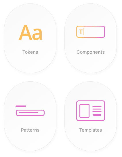
Due to the constantly evolving nature of the platform, I decided to create a flexible architecture that could easily adapt to future changes. After conducting research and consulting with our developers, I implemented a modern version of the atomic design approach. This involves breaking down elements into their smallest, most basic form and building them up from there. Design tokens served as the foundation, which in turn were used to make components. These components later became patterns and, finally, templates.
Due to the constantly evolving nature of the platform, I decided to create a flexible architecture that could easily adapt to future changes. After conducting research and consulting with our developers, I implemented a modern version of the atomic design approach. This involves breaking down elements into their smallest, most basic form and building them up from there. Design tokens served as the foundation, which in turn were used to make components. These components later became patterns and, finally, templates.
Due to the constantly evolving nature of the platform, I decided to create a flexible architecture that could easily adapt to future changes. After conducting research and consulting with our developers, I implemented a modern version of the atomic design approach. This involves breaking down elements into their smallest, most basic form and building them up from there. Design tokens served as the foundation, which in turn were used to make components. These components later became patterns and, finally, templates.
Upon thorough deliberation, I opted to store all our design elements and style guidelines in Figma. Inside Figma, I established a library document that functioned as the basis of our design framework. This library let us create styles and components that were accessible to our team or organization and applicable in various designs.
For the development aspect, we utilized Storybook, a free-to-use frontend workspace, enabling us to develop UI components and pages independently. This strategy permitted the creation of a sturdy and expandable design system, which could be effortlessly managed and updated over time.
An adaptive architecture
An adaptive architecture
An adaptive architecture
To begin building the design system, I focused on establishing the foundations of our visual language, which are the basic design tokens. These include colors, spacing, iconography, elevation, grids, borders, opacity and breakpoints.
To begin building the design system, I focused on establishing the foundations of our visual language, which are the basic design tokens. These include colors, spacing, iconography, elevation, grids, borders, opacity and breakpoints.
To begin building the design system, I focused on establishing the foundations of our visual language, which are the basic design tokens. These include colors, spacing, iconography, elevation, grids, borders, opacity and breakpoints.
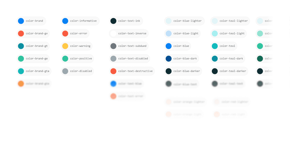
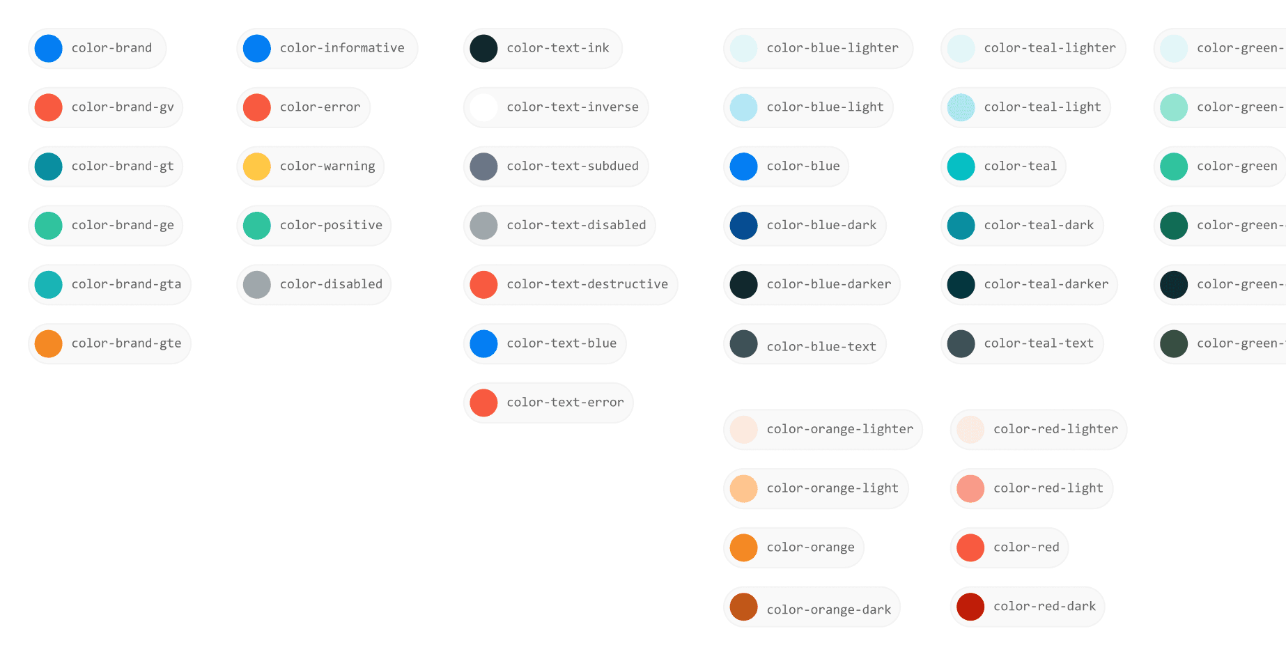
Color
Color
Color is an important element of our brand, as it helps to distinguish the brand and reinforce a consistent experience across products. We used color design tokens to manage the color palette and are categorized into four main groups: brand, semantic, text, and palette.
Color is an important element of our brand, as it helps to distinguish the brand and reinforce a consistent experience across products. We used color design tokens to manage the color palette and are categorized into four main groups: brand, semantic, text, and palette.
Color
Color is an important element of our brand, as it helps to distinguish the brand and reinforce a consistent experience across products. We used color design tokens to manage the color palette and are categorized into four main groups: brand, semantic, text, and palette.
Aa
font-display-xlarge
font-family: 'Open Sans'
font-style: normal
font-weight: 600
font-size: 38px
line-height: 46px
Aa
font-display-large
Aa
font-display-medium
AA
font-suheading
Aa
font-body
Aa
font-display-large
Aa
font-display-large
Aa
font-caption
Typography
Typography
Typography
The typeface plays a crucial role in how our users perceive our brand and interact with our products. We chose Open Sans as our default typeface because of its clarity, legibility, and versatility.
The typeface plays a crucial role in how our users perceive our brand and interact with our products. We chose Open Sans as our default typeface because of its clarity, legibility, and versatility.
The typeface plays a crucial role in how our users perceive our brand and interact with our products. We chose Open Sans as our default typeface because of its clarity, legibility, and versatility.
Iconography
Iconography
Iconography
Icons helps to represent common actions and convey information to users in a clear and concise manner. We have designed our icons aiming to balance our human side with function.
Icons helps to represent common actions and convey information to users in a clear and concise manner. We have designed our icons aiming to balance our human side with function.
Icons helps to represent common actions and convey information to users in a clear and concise manner. We have designed our icons aiming to balance our human side with function.
Spacing
Spacing
We use a fundamental unit of 8 pixels, which sets the tone for our spacing scale and guarantees a uniform visual appeal throughout our products.
We use a fundamental unit of 8 pixels, which sets the tone for our spacing scale and guarantees a uniform visual appeal throughout our products.
Elevation
Elevation
Elevations serve as the foundational layers that shape the UI's structure and appearance, providing a structured basis for the user experience.
Elevations serve as the foundational layers that shape the UI's structure and appearance, providing a structured basis for the user experience.
Spacing
We use a fundamental unit of 8 pixels, which sets the tone for our spacing scale and guarantees a uniform visual appeal throughout our products.
Elevation
Elevations serve as the foundational layers that shape the UI's structure and appearance, providing a structured basis for the user experience.
One of the key advantages of implementing a centralized design system is that it makes it easier for teams to communicate and collaborate. This proved to be particularly valuable as our design system evolved, as it allowed us to make changes quickly and efficiently without disrupting the work of other teams. Additionally, by ensuring that all teams had access to the latest versions of our design elements, we were able to maintain consistency and ensure that changes made to our design foundations were reflected across our product design.
One of the key advantages of implementing a centralized design system is that it makes it easier for teams to communicate and collaborate. This proved to be particularly valuable as our design system evolved, as it allowed us to make changes quickly and efficiently without disrupting the work of other teams. Additionally, by ensuring that all teams had access to the latest versions of our design elements, we were able to maintain consistency and ensure that changes made to our design foundations were reflected across our product design.
One of the key advantages of implementing a centralized design system is that it makes it easier for teams to communicate and collaborate. This proved to be particularly valuable as our design system evolved, as it allowed us to make changes quickly and efficiently without disrupting the work of other teams. Additionally, by ensuring that all teams had access to the latest versions of our design elements, we were able to maintain consistency and ensure that changes made to our design foundations were reflected across our product design.
Crafting the building blocks
Crafting the building blocks
Crafting the building blocks
After establishing the design system's core, I crafted foundational design components that underpinned intricate patterns and templates. For instance, let's consider the case of a button: I initiated by designing a basic button component encompassing crucial visual attributes like shape, size, and color.
After establishing the design system's core, I crafted foundational design components that underpinned intricate patterns and templates. For instance, let's consider the case of a button: I initiated by designing a basic button component encompassing crucial visual attributes like shape, size, and color.
After establishing the design system's core, I crafted foundational design components that underpinned intricate patterns and templates. For instance, let's consider the case of a button: I initiated by designing a basic button component encompassing crucial visual attributes like shape, size, and color.
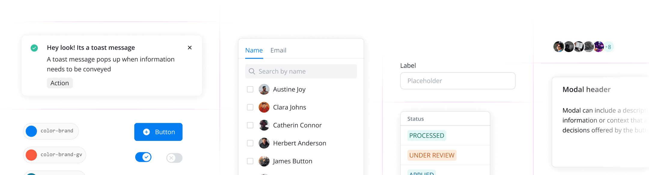
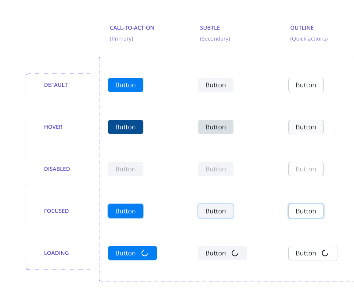
Button
Button
Buttons are an essential element of any user interface, as they allow users to trigger events and actions. In our design system, we have defined five different types of buttons.
Buttons are an essential element of any user interface, as they allow users to trigger events and actions. In our design system, we have defined five different types of buttons.

Button
Buttons are an essential element of any user interface, as they allow users to trigger events and actions. In our design system, we have defined five different types of buttons.
Button anatomy
Button anatomy
The button label is always in sentence case. When there is no icon, the padding on both sides are the same.
The button label is always in sentence case. When there is no icon, the padding on both sides are the same.
Button anatomy
The button label is always in sentence case. When there is no icon, the padding on both sides are the same.
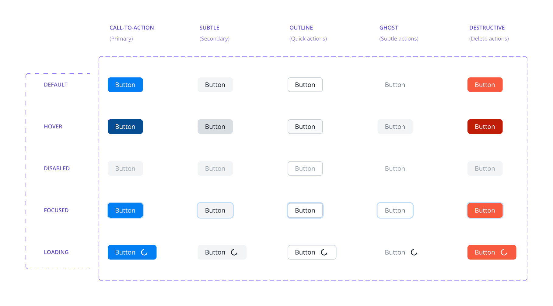
Button types
Button types
We have defined two different sizes for buttons: large and compact. The different types of buttons are CTA, subtle, outline, ghost and destructive. Buttons can also have different states, which reflect their current status or behavior and they are default, hover, disabled, focused, and loading.
We have defined two different sizes for buttons: large and compact. The different types of buttons are CTA, subtle, outline, ghost and destructive. Buttons can also have different states, which reflect their current status or behavior and they are default, hover, disabled, focused, and loading.
Button types
We have defined two different sizes for buttons: large and compact. The different types of buttons are CTA, subtle, outline, ghost and destructive. Buttons can also have different states, which reflect their current status or behavior and they are default, hover, disabled, focused, and loading.
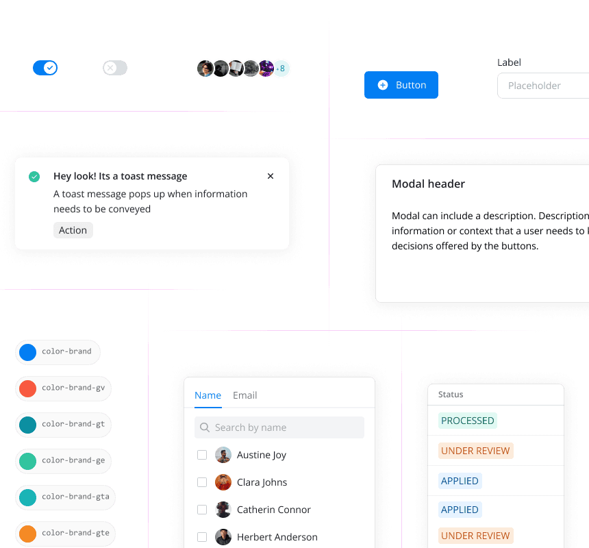
Similarly, I moved on to design and implement other components, such as text fields, switches, checkboxes, cards, and many more. Like the buttons, these components were designed with different states and behaviors, and their usage was carefully documented. This allowed me to create a library of components that could be easily reused during the design process and that were straightforward for developers to comprehend and implement.
Similarly, I moved on to design and implement other components, such as text fields, switches, checkboxes, cards, and many more. Like the buttons, these components were designed with different states and behaviors, and their usage was carefully documented. This allowed me to create a library of components that could be easily reused during the design process and that were straightforward for developers to comprehend and implement.
Similarly, I moved on to design and implement other components, such as text fields, switches, checkboxes, cards, and many more. Like the buttons, these components were designed with different states and behaviors, and their usage was carefully documented. This allowed me to create a library of components that could be easily reused during the design process and that were straightforward for developers to comprehend and implement.
Seeing the bigger picture
Seeing the bigger picture
Seeing the bigger picture
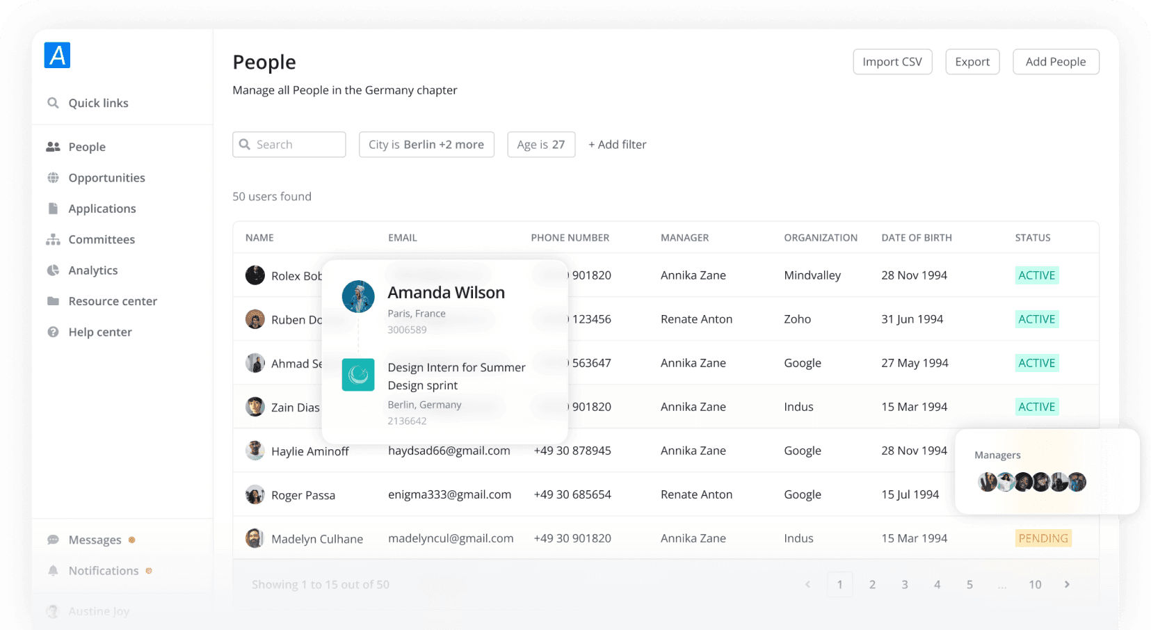
Following the atomic design model, we grouped the components to create more complex components. These reusable combinations of components were then used to create patterns that solved common user problems. Together with templates, these components and patterns were used to create the final page design. By utilizing this approach, we were able to create a consistent and user-friendly experience for our users.
Following the atomic design model, we grouped the components to create more complex components. These reusable combinations of components were then used to create patterns that solved common user problems. Together with templates, these components and patterns were used to create the final page design. By utilizing this approach, we were able to create a consistent and user-friendly experience for our users.
Following the atomic design model, we grouped the components to create more complex components. These reusable combinations of components were then used to create patterns that solved common user problems. Together with templates, these components and patterns were used to create the final page design. By utilizing this approach, we were able to create a consistent and user-friendly experience for our users.
1
2
3
4
5
6
7
8
9
10
11
12
13
14
15
16
17
18
19
20
21
22
23
1
2
3
4
5
6
7
8
9
10
11
12
13
14
15
16
17
18
19
20
21
22
23
import DropdownMenu, {
DropdownItemRadio,
DropdownItemRadioGroup,
} from '@expa-design-system/dropdown-menu';
const DropdownOpenExample = () => {
const [isOpen, setIsOpen] = useState(false);
return (
<DropdownMenu
isOpen={isOpen}
onOpenChange={(attrs: OnOpenChangeArgs) => {
setIsOpen(attrs.isOpen);
}}
trigger="Page actions"
>
<DropdownItemRadioGroup id="actions">
<DropdownItemRadio id="option1">Option 1DropdownItemRadio>
<DropdownItemRadio id="option2">OPtion 2DropdownItemRadio>
DropdownItemRadioGroup>
DropdownMenu>
);
};
The next step in the process was to hand over the design to the developers. Fortunately, the developers had been involved in the design phase from the beginning, which made the onboarding process smooth and seamless.
Detailed documentation was a crucial part of the design process, which helped to eliminate any ambiguity and ensure that the developers had a clear understanding of what needed to be done.
To ensure that the development process was efficient and effective, the team developed and tested one component at a time using Storybook. We made regular updates based on the results of our testing, which helped to ensure that the final product met all of our requirements and exceeded our expectations.
Impact-driven approach
Impact-driven approach
Impact-driven approach
Crafting a design system is intricate and time intensive. Evaluating its impact with meaningful metrics is crucial. Four months post-implementation, we delightedly witnessed its success through evident positive outcomes.
Crafting a design system is intricate and time intensive. Evaluating its impact with meaningful metrics is crucial. Four months post-implementation, we delightedly witnessed its success through evident positive outcomes.
Crafting a design system is intricate and time intensive. Evaluating its impact with meaningful metrics is crucial. Four months post-implementation, we delightedly witnessed its success through evident positive outcomes.
98% component adoption
98% component adoption
We estimated that more than 98% of the new designs are created using the EDS components.
We estimated that more than 98% of the new designs are created using the EDS components.
98% component adoption
We estimated that more than 98% of the new designs are created using the EDS components.
46% faster development
46% faster development
46% faster development
Development time decreased drastically, thus we were rolling out new features into production faster than ever.
Development time decreased drastically, thus we were rolling out new features into production faster than ever.
Development time decreased drastically, thus we were rolling out new features into production faster than ever.
2x design speed
2x design speed
Our designers were able two double their design output after the implementation of the design system.
Our designers were able two double their design output after the implementation of the design system.
2x design speed
Our designers were able two double their design output after the implementation of the design system.
Consistency and efficiency
Consistency and efficiency
Consistency and efficiency
We were able to build efficiently and eliminate all inconsistencies in our new builds.
We were able to build efficiently and eliminate all inconsistencies in our new builds.
We were able to build efficiently and eliminate all inconsistencies in our new builds.
A great learning experience
A great learning experience
A great learning experience
I learned a lot of things while building this design system and the following are a few of them.
I learned a lot of things while building this design system and the following are a few of them.
I learned a lot of things while building this design system and the following are a few of them.
Design system is a journey
Design system is a journey
Design system is a journey
I initially aimed for a perfect design system from the start, but building and implementing the Expa Design System showed me it's a dynamic, evolving entity. Rather than pursuing instant perfection, focusing on a solid foundation and continuous refinement is key.
I initially aimed for a perfect design system from the start, but building and implementing the Expa Design System showed me it's a dynamic, evolving entity. Rather than pursuing instant perfection, focusing on a solid foundation and continuous refinement is key.
I initially aimed for a perfect design system from the start, but building and implementing the Expa Design System showed me it's a dynamic, evolving entity. Rather than pursuing instant perfection, focusing on a solid foundation and continuous refinement is key.
Collaboration is key
Collaboration is key
Collaboration is key
As a design system designer, I've realized the vital role of consistent, open communication with all users. Being the team's bridge via meetings, online discussions, and clear documentation nurtures collaboration, enabling us to tackle conflicts early and strengthen the design system.
As a design system designer, I've realized the vital role of consistent, open communication with all users. Being the team's bridge via meetings, online discussions, and clear documentation nurtures collaboration, enabling us to tackle conflicts early and strengthen the design system.
As a design system designer, I've realized the vital role of consistent, open communication with all users. Being the team's bridge via meetings, online discussions, and clear documentation nurtures collaboration, enabling us to tackle conflicts early and strengthen the design system.
Learn more by teaching
Learn more by teaching
Learn more by teaching
I onboarded our designers and developers to the new design system, which involved Figma, an unfamiliar tool for many. I conducted personalized sessions and crafted a detailed guide to navigate the component library effectively.
I onboarded our designers and developers to the new design system, which involved Figma, an unfamiliar tool for many. I conducted personalized sessions and crafted a detailed guide to navigate the component library effectively.
I onboarded our designers and developers to the new design system, which involved Figma, an unfamiliar tool for many. I conducted personalized sessions and crafted a detailed guide to navigate the component library effectively.
I was fortunate to have the opportunity to work with an incredible team on this exciting project.
I was fortunate to have the opportunity to work with an incredible team on this exciting project.
I was fortunate to have the opportunity to work with an incredible team on this exciting project.
Arian Edward
Arian Edward
Project lead
Project lead
Project lead
Austine Joy
Austine Joy
Research, design and documentation
Research, design and documentation
Research, design and documentation
Manzur Khan, Vivek Srivastava, Michael Victor
Manzur Khan, Vivek Srivastava, Michael Victor
Development
Development
Development
Raghul Kuduva, Nikita Vergis, Soumya Nigam
Raghul Kuduva, Nikita Vergis, Soumya Nigam
Design support
Design support
Design support
Available for work
Want us to work together?
Want us to work together?
Contact me for full time roles or freelance projects. I have worked remotely with clients across the globe, so time zones pose no barrier.
Contact me for full time roles or freelance projects. I have worked remotely with clients across the globe, so time zones pose no barrier.
Copy email
X | Twitter
Copy email
X | Twitter
Copy email
X | Twitter